A Favourite Furniture Designer - Milo Baughman

One of the great things about your job also being a passion is that you spend hours surfing the net and learning about new furniture styles and the designers who created them without even realizing the time has gone by.  One of the designers I stumbled across after crushing on many of his designs was Milo Baughman.  He has many different styles of furniture and worked for a few different furniture makers but his best collaboration was with the furniture maker Thayer Coggin.  This business relationship lasted over 50 years until Milo's death in 2003.  Most of the pieces available today through 1st Dibs and Ebay were brought about through this collaboration.

Milo Baughman on the lounger and Thayer Coggin standing(plus very cute dog : )

Milo Baughman on the lounger and Thayer Coggin standing(plus very cute dog : )

Milo Baughman's interest in design started at a very young age.  At 13, his family moved to Long Beach, California and his parents had him design both the interior and exterior of their new house.  I wish I could track down photos of that house!  After serving in the war for four years (WWII) he returned to Southern California to study product and architectural design.  He was hired right out of school by a custom, all modern, west coast furniture store.  This proved to be a great launching pad for his career.  He designed for many manufacturers before his association with Thayer Coggin began in 1953. It was his enchantment with "California Moderne" that really influenced his designs.  

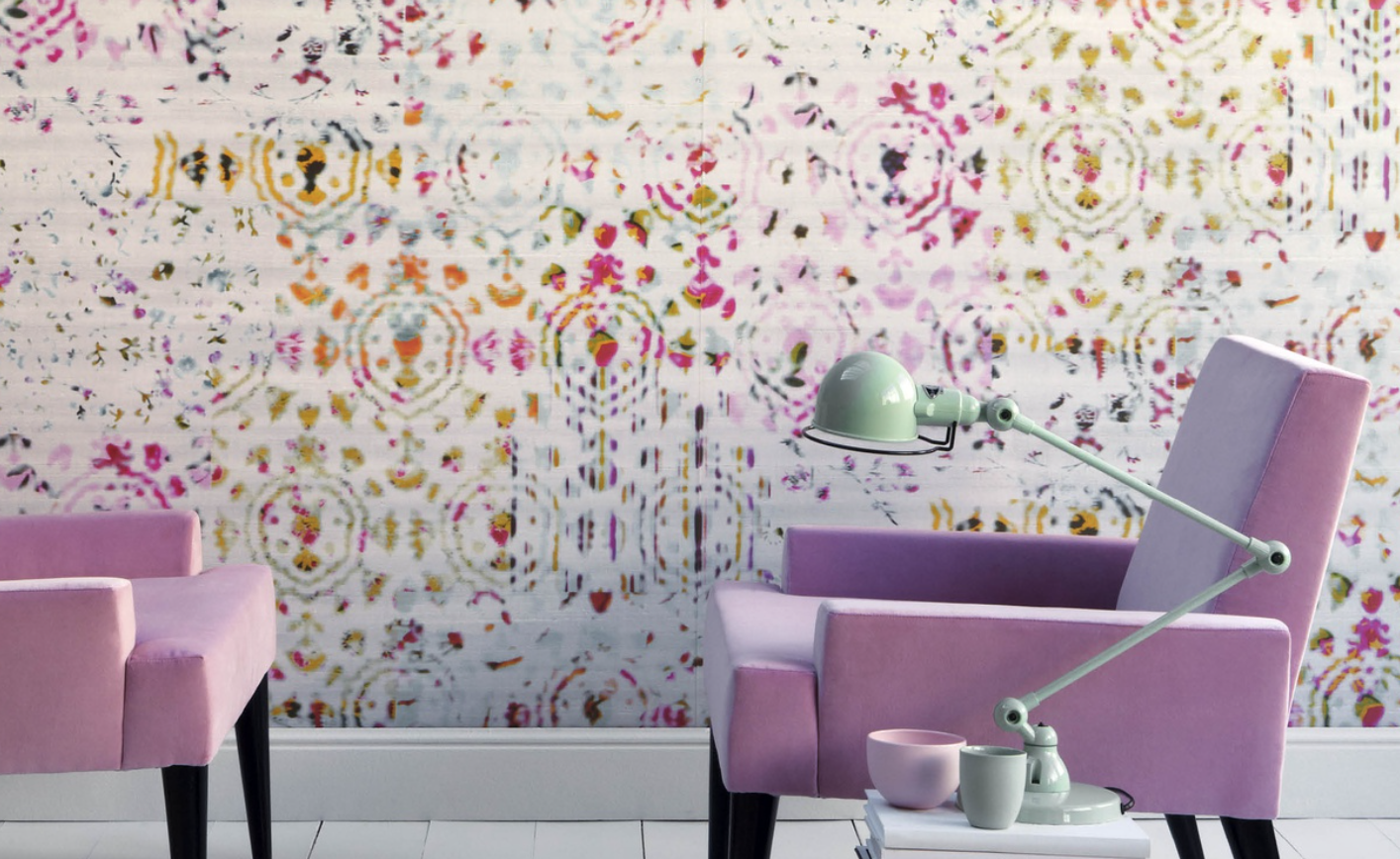
Baughman's designs are timeless.  What is so amazing when looking at his body of work is just how many pieces look familiar.  Some of today's big stores (West Elm, Crate & Barrel, etc) best selling pieces are based off of his designs.  His designs were forward thinking and distinctive, and yet unpretentious and affordable.  See how many pieces you recognize?

My favourite sofa by Baughman.  Although I would prefer it in a charcoal grey mohair : )

My favourite sofa by Baughman.  Although I would prefer it in a charcoal grey mohair : )

A sofa I see in Architectural Digest on a regular basis.

A sofa I see in Architectural Digest on a regular basis.

This sofa literally looks like it's floating in a room.  Love the original 70's fabric ; )

This sofa literally looks like it's floating in a room.  Love the original 70's fabric ; )

An overall style to be replicated everywhere.  Note the recessed plinth - classic Baughman.

An overall style to be replicated everywhere.  Note the recessed plinth - classic Baughman.

Milo didn't just design soft furnishings, he also designed some great sideboards, dressers, and tables.  Some of his favourite materials to work with were Burl wood, brass, chrome, and glass.  

Amazing etagere!

Amazing etagere!

Burl wood cabinet with chrome base.

Burl wood cabinet with chrome base.

An oft replicated campaign desk.

An oft replicated campaign desk.

Although I wouldn't want every piece Milo designed in my house, I really love his work and I covet that tufted sofa!  One day...

Little Girl's Bedroom

Right now our family is living in a rental house while we decide what we want to do for a forever house (is there such a thing???).  We just finished renovating what we thought would be 'the house' but sadly the school board has changed boundary lines and so the neighbourhood won't work for us anymore.  So right now we are in limbo.  Two of our girls have been sharing a bedroom these past couple of years and it isn't working out so well.  We figured they would each have their own room in the new house but now we aren't moving in.

To appease my girls (and save my sanity), I have decided to sacrifice my little office so it can become a bedroom for our eight year old.  While I am NOT looking forward to clearing everything out of my office and reorganizing in the basement, I am looking forward to creating a fabulous little bedroom for my littlest girl!  I love designing kids' bedrooms, and especially one that is so personal to someone I love : )

The closet wall.

The closet wall.

The east facing window.

The east facing window.

The little hallway into the room.

The little hallway into the room.

Please don't judge my functional yet undesigned space : )

While small, this room has a big window that lets in a lot of light and has a ton of cupboard space!  The units are Ikea and so it will be easy enough to kit them out with kid friendly storage solutions.  I have some leftover amazing wallpaper that I can use on one wall which will lead the design.  The overall colour scheme will be pinks and oranges (with a touch of chartreuse).

Love the colour in this room!

Love the colour in this room!

I love how simple yet fresh this room feels!

I love how simple yet fresh this room feels!

Another fun pink and tangerine girl's bedroom.

Another fun pink and tangerine girl's bedroom.

The awesome vinyl paper that will cover one wall -

Kandy wallpaper by Elitis.  LOVE this!!!

Kandy wallpaper by Elitis.  LOVE this!!!

Fun colour scheme -

Fun colour scheme -

Since we don't know how long we are going to be here I don't want to commit a lot of money to this project but I do want to make it feel special.  The huge cabinets mean that we don't have to commit to any larger furniture pieces (other than a bed).  I want to find a fun, bright carpet that is soft on the feet, create a daybed feel with the bed placed beneath the window, a custom window blind, use a few brass pieces, and have a super comfy chair in the corner.  These are some pieces I am considering:

The design board with a few different choices : )

The design board with a few different choices : )

  I should also mention that I would paint out the drawer fronts under the bed as I think the black is a bit strong with the wallpaper.  The plan is to start working on her room next month so I will definitely keep you posted on the progress!

Favourite White Paints

While painting rooms (or whole houses) white is not for everyone - I love the look!  I had always been nervous about painting my house white (or substantial parts of it) for fear of it looking too plain but got to try it out quite by happenstance.  When we renovated our previous home we had to move into an apartment for a year that had been painted all white.  While the white wasn't my favourite, I really loved how our art, furniture, and carpets looked with such a simple backdrop.  The apartment was south facing and so flooded with light, it also really helped sell me on the white.  White looks amazing with natural light!

Gorgeous apartment in NY city.

Gorgeous apartment in NY city.

White with wooden built-ins - amazing!

White with wooden built-ins - amazing!

While we didn't paint our entire house white, we did paint our family room and kitchen both white.  We painted all of our hallways/entry ways a very light warm grey as they help to hide dirt a bit more than white.  Did I mention we have four kids and a dog : )  I absolutely loved the way those rooms felt!

Our kitchen painted white.

Our kitchen painted white.

Something that I learned while choosing the whites that were used in the house is that not all whites are created equal.  Whites are really effected by direction (north/south/east/west) and by what other colours/wood tones are being used in the room.  While we were able to use Wimborne White by Farrow & Ball throughout the kitchen and the kids bedrooms, it looked terrible in the family room.  Thankfully we were able to use another white since the rooms are fully divided and so everything reads as the same colour, but it is something to watch for in an open concept space.

I have now done white rooms (and entire homes) for many clients and have developed a few favourites.  My favourite overall white paint is also Benjamin Moore's colour of the year - Simply White OC117.  I love this white as it's very clean but it doesn't feel sterile.  Since it has a yellow undertone it works beautifully in north facing rooms.  It also works very nicely with wood.  Just one word to the wise, it takes multiple coats to get the true colour.  A big pain if you are doing the painting yourself (I know!).

Benjamin Moore Simply White

Benjamin Moore Simply White

Another favourite white of mine is Wimborne White by Farrow & Ball.  Thankfully this paint only requires two coats (assuming you use a primer)!  Although it looks very creamy on it's own, it looks very crisp against bright colours.  I love this as a trim paint as well as on walls!

Farrow & Ball - Wimborne White

Farrow & Ball - Wimborne White

Another shot of Wimborne White

Another shot of Wimborne White

My go to white if I need a crisp, pure white is Chantilly Lace by Benjamin Moore.  It has virtually no undertones and so works beautifully with carrera marble.

Cabinets are painted Chantilly Lace by Benjamin Moore.

Cabinets are painted Chantilly Lace by Benjamin Moore.

Walls are painted Chantilly Lace by Benjamin Moore - looks great with carrera countertops!

Walls are painted Chantilly Lace by Benjamin Moore - looks great with carrera countertops!

I hope you've enjoyed looking at these white rooms.  I realize white isn't for everyone but I have to say, I am definitely crushing on white : )

Farmhouse bathroom on a budget

I’m up north for this Family Day long weekend and very excited to have FOUR days to take things a little slower.  There’s something about being at our country home (MUCH less ostentatious than it sounds : )  that relaxes me in a way that nothing else can.

Even our dog gets in on the relaxation!

Even our dog gets in on the relaxation!

It is for this reason that I think I enjoy designing weekend homes so much.  They represent everything we work so hard for – quality family time, being outdoors, great food & drink, comfort, low-key gatherings, and walls with no clocks. 

Making a snow angel in freshly fallen snow : )

Making a snow angel in freshly fallen snow : )

I love outdoor fires!

I love outdoor fires!

These homes don’t have to cost a fortune and they certainly don’t need to cost a fortune to transform.  This will be the first of a series of blogs about creating great rooms on a budget.  The first one is creating a farmhouse bathroom that will be both beautiful and functional (and not break the bank!).

Love the ship lathe and the patterned tiles!

Love the ship lathe and the patterned tiles!

A more modern take on the farmhouse bathroom - designed by Amber Interiors.

A more modern take on the farmhouse bathroom - designed by Amber Interiors.

My personal favourite designed by Kirsten Marie.

My personal favourite designed by Kirsten Marie.

Farmhouse bathrooms can vary greatly in design but as a general rule they are much simpler in design and created with low maintenance materials.  Because of this it is much easier to create this look on a tight budget.

Gazette Vanity $670, Home Depot.  Kingston Brass Faucet $150, Home Depot.  Tork Mirror $229, CB2.  Princeton Sconce $244, Schoolhouse Electric.  Brass Towel Bar $90, Schoolhouse Electric.  Fairview Knob $18/each, Schoolhouse Electric.  Painterly Stripe Shower Curtain $54, Schoolhouse Electric.  Imperfect Piazza Petite Cement Tiles $10.67 sqft, Villa Lagoon.  Dalton White Tile 6x6 $2 sqft, Home Depot.  Pegasus Marble Vanity Top $514, Home Depot.

Although you could definitely go even more budgetI think this is a good compromise between some well priced foundation pieces and some great splurges. 

Enjoy!


My Current Obsession

I know this is a strange declaration but I LOVE cold countries!  We had the most beautiful February day ever (Toronto and it was sunny and 14!) and all I thought was I miss the cold.  Maybe it’s the romantic in me but I love everything that has to do with the cold and keeping cozy.  I love the cosy sweaters, I love hats and scarves, the way trees crack as they sway in the winter breeze, fresh snow, roaring fires, warm blankets, the list goes on and on!

What a cosy blanket!

What a cosy blanket!

Love these textures combined!

Love these textures combined!

The architecture and design in northern climates has been adapted over time to these long winters.  The houses celebrate light, warmth, and a connection to the great outdoors.  These houses generally have large windows and glass doors, wooden floors, wool rugs, a fireplace, white walls, and a simplicity in their decoration. 

A Swedish cottage in the summer

A Swedish cottage in the summer

A Finish home in the winter - so spectacular!

A Finish home in the winter - so spectacular!

Another home in the summer

Another home in the summer

What I’m really drawn to are the houses that are dark on the outside but white on the inside.

I could totally live here!

I could totally live here!

So simple...

So simple...

I love their starkness!

I love their starkness!

These homes work beautifully in both the winter and the summer.

I am in love...

Styling Shelves

The display of books and collectibles add warmth and personality to any space.  To someone looking at your shelves, it tells them a bit about you – what you read, what you collect, and what you love.  Bookcases can be seen as a window into your passions and pursuits, and an opportunity to put your favourite things on display.

Design and styling by JG Interiors

Design and styling by JG Interiors

The challenge is how to style a bookcase well.  How do you maximize both utility and aesthetic appeal without turning your shelves into a thriftshop?  Styling a bookcase draws on a lot of the principles of design – scale, balance, contrast, pattern, and harmony.   It is definitely more of an art and the more time you spend doing it, the better you get.  That being said, there are a few rules that can help you get started.

Modern Shelves by JGInteriors

Modern Shelves by JGInteriors

Styling guru Emily Henderson recommends these four tips in styling your own bookshelves –


Mix it up

Generally when styling bookshelves, you want to mix up what goes on them.  It’s nice to have a combination of books and objects that show off your personality.  There are no hard and fast rules about amount of books, just remember that all books can feel a bit heavy and library like.

The art of doing stuff

The art of doing stuff

Colour palette

It’s always good to stick to a colour palette when selecting items for the shelves.  It can be a painting, or just a current favourite palette.  Limiting yourself to 4 or 5 hues that match the rest of the room is key.  Too many colours will turn the shelves into garish ville – definitely not the effect you are after.

Emily Henderson

Emily Henderson

Vary shapes and sizes

Having 4 picture frames all the same size does nothing for a shelf but varying their size and shape will really draw your eye in.  It’s the same thing with personality pieces, taller pieces such as vases and candle sticks look great when placed with smaller, rounder objects. 

Centsational Girl Blog

Centsational Girl Blog

Storage

It always looks good to add a few storage pieces on the shelves.  They can be full baskets at the bottom for games or blankets, or they can be smaller baskets and boxes that get placed amongst the books. 

Pinterest

Pinterest

Another trick I like to use a lot is adding colour to the back of the shelves.  I have done this through paint, as well as with grasscloth wallpaper.  I have seen blogs where people have also used fabric or giftwrap.  The only caution I advise if you choose to do this is pay attention to the colour palette.  Iron objects don’t show up against a dark background and white vases don’t show up as well on a white background.

Pinterest

Pinterest

Good-luck and have fun!

Current Obsession - Cement Tiles

I am always struck by a room that uses cement (or encaustic) tiles.  Because each tile is made by hand they feel more like works of art as oppose to just simply tiles.   A few years ago I can across an image of a beautiful restaurant patio in Mexico and was immediately smitten!

After a bit of image sleuthing, I found the original restaurant!  I love how the tile wraps up the wall!

After a bit of image sleuthing, I found the original restaurant!  I love how the tile wraps up the wall!

A much better view with which you can truly see the tile.

A much better view with which you can truly see the tile.

The central meeting point - love it!

The central meeting point - love it!

It’s amazing that such a simple pattern can create such drama.  Cement tiles are known for their shapes, their pattern (always geometric), and their colours.

The tiles really make the design - love the star pendant used with the star tiles!

The tiles really make the design - love the star pendant used with the star tiles!

Tile from the Cement Tile Shop - they have a fantastic selection!

Tile from the Cement Tile Shop - they have a fantastic selection!

Here they are being used in a more modern bathroom.

Here they are being used in a more modern bathroom.

They can be used on the floor and the walls, both inside and outside.  I have even seen them used for sidewalks in Cuba, harkening back to the pre Castro days.

Here they are being used as a dramatic backsplash.

Here they are being used as a dramatic backsplash.

A striking feature wall.

A striking feature wall.

These colours give off a much more time worn feel.

These colours give off a much more time worn feel.

Mixing and matching different tiles.

Mixing and matching different tiles.

I love how the tile wraps up the wall from the floor - very striking in contrast to the white subway tiles.

I love how the tile wraps up the wall from the floor - very striking in contrast to the white subway tiles.

They are commonly used in courtyards in Morocco and Spain – beautiful!

What a beautiful green!

What a beautiful green!

Look at the incredible tiling around and in the fountain -

Look at the incredible tiling around and in the fountain -

Needless to say, I am dying to use these tiles on a project!  I am personally more drawn to the simple tiles but nothing says drama better than a wall of more ornate cement tiles.  Enjoy!


Powder Room Horror

The other day I was over at a friend’s house who is currently renting while renovating her own house.  The powder room in her rental was completely redone right before she moved in 8 months ago.

Most tiny , ugly bathroom...

Most tiny , ugly bathroom...

Most tiny, ugly bathroom part two... What is up with the river rock ledge???

Most tiny, ugly bathroom part two... What is up with the river rock ledge???

Seriously!

Seriously!

What was the landlord thinking!  I have to say that this powder room is officially the most unattractive bathroom I have ever been in.  Aside from just bad looks, it is not very functional either.  Looking at this bathroom actually made me sad as good design doesn't need to cost any more than bad design.  Had this landlord hired a designer just for a concept so many permanent mistakes could have been avoided.  

Powder rooms really are quite simple – all they require is a toilet, a vanity (hopefully with storage), lighting, and a mirror.  It is what we select and how we pull it together along with a wall treatment and a floor treatment that can really make a powder room sing!  Even the tightest budget can work wonders in the powder room – especially if you are a bit handy.

Keeping budget and space in mind here are a few powder rooms that look fantastic.  

What a fun powder room!

What a fun powder room!

1. Ung Drill Mirror $24.99, Ikea  2. Villa Fiori $240/per roll, Gaston Y Daniela  3.  Boulevard sink including pedestal $209, Home Depot  4. Millennium faucet $208, Kingston Brass  5. Contour Single Sconce $49, Wes…

1. Ung Drill Mirror $24.99, Ikea  2. Villa Fiori $240/per roll, Gaston Y Daniela  3.  Boulevard sink including pedestal $209, Home Depot  4. Millennium faucet $208, Kingston Brass  5. Contour Single Sconce $49, West Elm

A simple, clean bathroom.

A simple, clean bathroom.

1. Dolle walnut floating shelf $33.99, Bluestone Shelves 2. American Imaginations sink $246.75, Home Depot 3. Metropolitan glass tiles in Juno $27.50/sqft, Mosaic Tile USA 4. Frameless mirror $14.99, Target 5. Gold Lotus pendant $99.99, World Market

1. Dolle walnut floating shelf $33.99, Bluestone Shelves 2. American Imaginations sink $246.75, Home Depot 3. Metropolitan glass tiles in Juno $27.50/sqft, Mosaic Tile USA 4. Frameless mirror $14.99, Target 5. Gold Lotus pendant $99.99, World Market

Another beautiful powder room.

Another beautiful powder room.

A much loved bathroom on pinterest that could easily translate into a powder room.

A much loved bathroom on pinterest that could easily translate into a powder room.

These are just a few examples of powder rooms that have been done right along with helpful hints and sources to demonstrate how little some of these bathrooms can cost.

Remember, good design doesn’t need to cost any more than bad design.  It might require a bit more thought and planning but isn’t it worth it?

Window Styles

One of the features I always notice in houses and buildings are the windows.  As silly as it sounds, I have always felt that as eyes are the windows to the soul, windows tell us about the soul of a house. 

Stunning steel windows were used in this restoration - how warm and inviting!

Stunning steel windows were used in this restoration - how warm and inviting!

Single hung wooden windows - simple but classic - cool NYC

Single hung wooden windows - simple but classic - cool NYC

My dream house for up north - the windows make it almost disappear

My dream house for up north - the windows make it almost disappear

Windows can completely change the way a building reads – style, material, colour, and quality.  Sometimes while I am out walking the dog I like to look at houses and think about what I would do as a designer to improve the look of their fronts – and 99% of the time it involves either changing the windows or bringing the rest of the house in line with the windows.


The house being overhauled - nice windows - not!!!!

The house being overhauled - nice windows - not!!!!

Up close example of the cheap vinyl windows found all over the house

Up close example of the cheap vinyl windows found all over the house

One of my projects right now is a full scale redesign and renovation on a house that is the ugly duckling on the street.  Sadly, the previous owners replaced the leaded glass windows with plain, inexpensive vinyl ones.  While the house is a brick house built in 1911 it currently lacks any true style.  As we are creating a much more clean lined, modern home – this has had us really thinking in regards to window style.  Due to the lack of any real architectural features on the home, we can really go in any direction.  We are at the point that the windows will need to be ordered this week and so after considering and drafting more than a few options we have a winner!


A style we were considering

A style we were considering

Another style option...

Another style option...

The style winner - a photo from one of my many dog walks : )

The style winner - a photo from one of my many dog walks : )

The front of the house will be a very clean and simple take off of a classic window design in the late 1800’s early 1900’s.  This will give a nod to the period homes on the rest of the street while giving a more modern sensibility on the inside.  They will be manufactured by a company who makes European style tilt turn vinyl windows here in Toronto with German hardware.  The company is called Euro Vinyl Windows and Doors Inc and I was thrilled to stumble upon them. 


An interior shot of their vinyl windows - the German hardware allows for both tilting and casement swing - fantastic!

An interior shot of their vinyl windows - the German hardware allows for both tilting and casement swing - fantastic!

Exterior example of their sliding doors baked black

Exterior example of their sliding doors baked black

The back of the house will have full size windows and doors (8 feet!) to let in as much light as possible.  I can’t wait to see them once they are installed!  As I mentioned earlier – windows really do make a huge difference in the look and feel of a house – both on the inside and the outside.  The windows will really help transform this ugly duckling into a swan.


A stunning steel window from the inside - steel is my personal favourite : )

A stunning steel window from the inside - steel is my personal favourite : )

Another example of steel done in a more modern way - love the height!

Another example of steel done in a more modern way - love the height!

An example of traditional windows at full height

An example of traditional windows at full height

A simple hung window in a new farmhouse

A simple hung window in a new farmhouse

When the window complements the style of the house the effect is seamless - it feels like it is just meant to be.  This is certainly true for the interior as much as the exterior.  Do you ever notice windows?

Alice Street TV Room Makeover

We bought a century brick home up north last summer and I have been slowly (emphasis on the slowly) working at making it our own.  We actually rented the house during ski season for the last four years and were quite fond of it.  When the opportunity came up to buy it we jumped on it!  I have spent countless evenings over the last few years imagining what I would do if it were ours.   Fortunately it came fully furnished and so we were able to enjoy it right away. 

Alice winter

Fully furnished also means someone else’s taste is all around you.  It has been so exciting to be able to make changes to the place and watch it become what I knew it could be.   Since we are only up on the weekends about half the time (off ski season) it hasn’t given me much time to work on it.  I do thoroughly enjoy the moments I can work on it. 

The first thing I attacked was the small TV room on the main floor.  I figured it was small and contained (and had bad holly hobby wallpaper) and so could easily be updated over the course of a week.  A week was all the time I had before we headed off on our family vacation. 


Inspiration - a bit moody

Inspiration - a bit moody

Another inspiration - love the texture!

Another inspiration - love the texture!

The plan was to remove the wallpaper (walls and ceiling), repair the old plaster walls, prime and paint.  For some reason, I had visions of having it all done in a couple of days – no problem!  Ha – famous last words.  I rented a steamer for 24 hours to help remove the wallpaper.  Thanks to 3 layers of wallpaper dating back to the 50’s (the newlyweds signed and dated the plaster before the original wallpaper went up) I spent about 20 hours continuously scraping at those walls and ceiling.   That room was steamier than a sauna!


The room before - great blue wallpaper and a classic border ; )

The room before - great blue wallpaper and a classic border ; )

The other side of the room - it's a tiny room.

The other side of the room - it's a tiny room.

A close-up of the layers...

A close-up of the layers...

Almost done...

Almost done...

Once I had returned the steamer it was time to hit the plaster repair.  This room had a lot of cracks – I quickly realized that was the reason for the wallpaper.  Plastering the walls wasn’t so bad until I had to sand.  I have now learned that you don’t want to be overly generous with the mud.  I was plastering and sanding over the course of 2 solid days.  My arms were DYING.


After a rest day of hiking and caving with my oldest daughter and her friend I was ready to start priming.  Thankfully, I had invested in a pole and so I was able to get the room, including the 9½ foot ceilings, done in a few hours.  It looked so good in white. 


Post plaster patching - I now know why they wallpapered!

Post plaster patching - I now know why they wallpapered!

With a coat of primer - what a difference!

With a coat of primer - what a difference!

The other side - LOVE that door.

The other side - LOVE that door.

I had decided that since it is a small, darker room, used only for movie viewing, it made more sense for it to be a really dark colour.  I have always loved Kendall Charcoal by Benjamin Moore – it’s a very dark, warm grey – and so that was the colour the room was to be. 


Kendall Charcoal by Benjamin Moore

Kendall Charcoal by Benjamin Moore

After four coats, my masterpiece was done!  Well, the shell at least.  I had also planned on pulling up the carpet but sadly the hardwood didn’t carry into that room and so I decided to leave the carpet for now.  Thankfully it is pretty neutral and works in the room.  To hide all of my messy paint spills (remember – I thought I was removing the carpet), I picked up a great area carpet from West Elm.  Not being a fan of the tassels, my son and I untied them, cut them down, and then retied them and so you can’t even see them anymore.


The Souk Wool Rug from West Elm.

The Souk Wool Rug from West Elm.

The sofa was an old comfortable sofa we had in the city and I had it recovered in some heavy grey linen.  It’s perfect in the room – the comfiest movie sofa.


A similar linen that was used to recover the sofa.

A similar linen that was used to recover the sofa.

The coffee table is one that came with the house but it works for now.  I have some plans for a new one that includes a DIY (sort of) but haven’t had the time to execute it yet.


There is also a plan for a gallery wall behind the sofa but that can wait for a rainy day.  Considering it’s -27 C with wind chill today – it may be awhile…


Sorry for the lighting : (

Sorry for the lighting : (

JG Signature.jpeg

And so it begins...

I’ve been wanting to start a blog for years.  I thought I had the perfect segway into blogging when we renovated our house back in 2011, but it didn’t happen.  Although a very busy time, the real reason it didn’t get started was because I needed it to look fabulous and I am SO not a techie.  I tried to start a few times but got so bogged down on trying to set it up that I would eventually just give up.  No blog.  Sigh.  After hiring someone to help me design and set up my website I finally found my opportunity!   Better late than never : )

Now that you know I am not a techie – let me tell you a bit more about myself.  I am a mother, a wife, an interior designer, and a compulsive volunteer (trying to curb that last one a bit : )  I have four wonderful kids who drive me a bit crazy sometimes, I am slightly obsessive about making lists AND crossing things off those said lists, I love everything about food – reading about it, preparing it, and eating it, I love to travel – from local road trips to cross-continental, and I love interior design.

Here's to living in a shoe!

Here's to living in a shoe!

Egyptian desert at dusk - stunning!

Egyptian desert at dusk - stunning!

I love being a designer.  I enjoy the people and I love the limitless possibilities when you are first starting a project.  I think everyone should be able to have a space that makes them happy.  I love to just take a space in – be it interior or exterior – and notice it.  Notice what makes it special.  Notice the possibilities.  A space can make me smile or it can make me feel angry.  Although I am probably more sensitive to space than most – I think everyone has emotional reactions to spaces/rooms.  Interior design should be thoughtful and well considered.  A home should always feel like home.    

Nordic inspired bedroom by Ikea - makes me smile : )

Nordic inspired bedroom by Ikea - makes me smile : )

A room that makes me anxious but has great potential.

A room that makes me anxious but has great potential.

As someone who has been reading blogs for years, I have a pretty good idea as to what format I want this blog to take.  I have always really enjoyed the blogs that not only have great photos, but that also teach me something.  The best is when the blogger is able to do this with wit and personality.  I really hope that is what I will be able to do here.  There are some bloggers who are so inspiring – they work hard, they confront and get passed their fears, they recognize and appreciate the moments that count, and they just keep moving forward.  Whenever I feel like I’ve hit a wall I think about these women and it helps me get past it.  Thank you to them.


Well, thanks for stopping by!

signature.jpg